Insect producer Innovafeed unveiled its new brand platform and identity, marking another bold step in its journey to feed tomorrow's world. The company's new brand identity represents its commitment to developing sustainable, impactful solutions for animals, people and the planet.
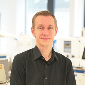
“We founded Innovafeed with the goal of improving the health and food sources for people and animals. By building a circular and zero waste agri-food chain replicating insects' role in nature, we are delivering on that goal, and reinventing our food system with a focus on quality, sustainability and resilience for everyone,” said Clément Ray, Innovafeed co-founder and CEO. “Our new brand launch represents this transformation by clearly reasserting who we are and what we stand for as we work across the globe to feed the world.”
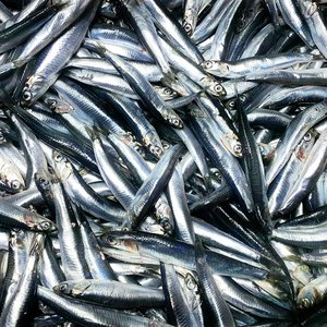
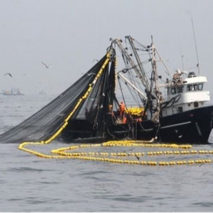
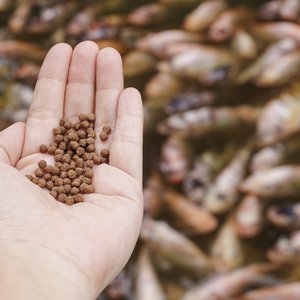
Innovafeed's new brand platform reaffirms its three founders' strong belief in the idea of tech for good and in deploying disruptive technology to tackle society's most dire challenges. With large-scale and sustainable production of insect-based nutrients for animals, people and the planet, Innovafeed has created a truly sustainable and natural food system. Innovafeed's Hermetia illucens vertical farm in Nesle (France) boasts the world's largest production capacity and the only circular, zero-waste model of its kind, optimizing environmental performance as well.
Innovafeed's new brand elements, to be rolled out at this week's AgriFood summit in San Francisco, include a new logo and brand colors. The new logo's three circles reflect the notion of positive impact with long-term resonance: the industrial reproduction of a natural process at scale. The colors reference the biotech sector, with the purple transitioning to a planet earth green-blue. The perfection of geometry underscores the company's quest for excellence and its enduring principle of circularity and zero waste. The clarity and geometric roundness of the typeface, meanwhile, echoes the brand's values of inclusion and openness.